
PRIMAL COLLECTION
What started as “failed DIY experimental clothing pieces” turned out to be a project I wanted to see through to the end. The Primal Collection features upcycled garments from my local thrift shop, which I manipulated into various forms, resulting in a bold, cohesive collection of designs that resemble animals or beasts — primal abstractions that I then modeled in and photographed.
I have been experimenting with clothing and solo photoshoot series for years, using various methods such as hand-dyed bleach, color dye, screen printing, heat transfer, sewing, and hand-painted designs. My interest in fashion and photography has been a hobby alongside my primary practice as a painter, but it is something I value and work to develop my skills in. While I still have a long way to go in terms of where I want my skill set to be in these mediums, I am also practicing putting out the creations I make in the meantime, as I often regret not showing work that doesn’t exactly showcase my full potential.
Interestingly, I have been sharing my clothing work on Depop, but not on my primary social media platforms, where I display my artwork. As a result, some pieces that would have been suitable for this series have fortunately been sold and are now in someone else's home. The pieces in this series were initially part of a bulk collection that was predominantly random. In the end, I decided to group them by theme, and the first one I’m sharing is the Primal Collection.
KITTY
The hand-dyed bleach method is my favorite so far, as I can create interesting patterns by mixing water and bleach on fabric, which has a very painterly feel, using individual spray bottles for easy application. When I first started using bleach, I was concerned for my health, mainly because at the time I was living in a basement with a lack of ventilation and was inhaling quite a bit. Still, I ended up wearing a mask for chemical usage, and eventually went outdoors. The bleach processing has a magical quality to it, as the image appears later on, and understanding or planning for the outcome is an enjoyable, mysterious experience. After some trials, I understood what color would come out of specific fabric colors, and the effects that come from navy are quite beautiful. KITTY was intentionally designed with navy cotton fabric and later overlaid with a lime green fishnet pattern using fabric crayon, resulting in a modest yet bold design that is elegant and kitten-like.

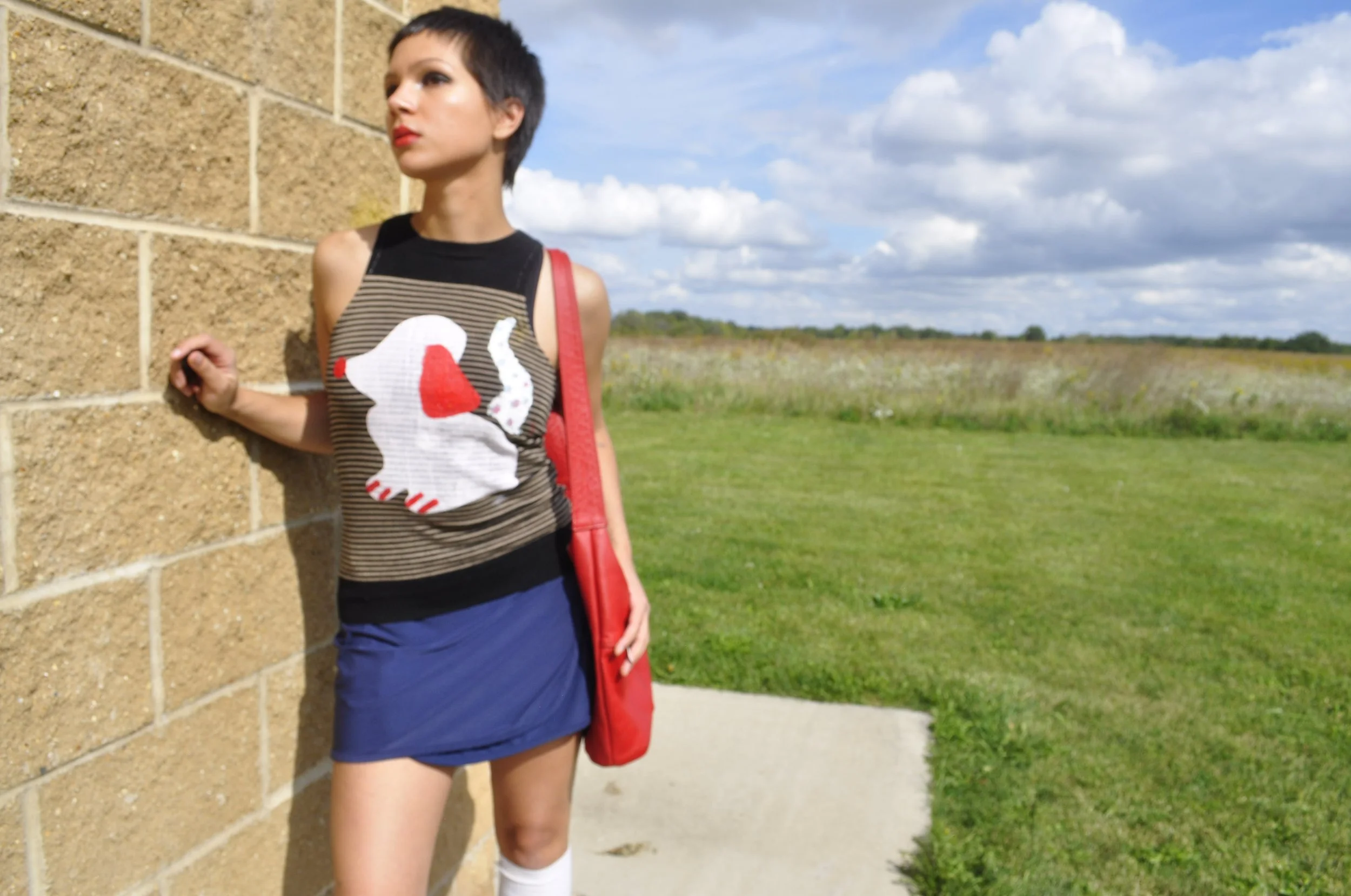
PUPPY
Screen printing has its pros, but for me, there are mostly cons. With the setup I had, screen printing was problematic in terms of my health and my intuitive approach to making. I actually had to call poison control to confirm that I wasn’t going to create an explosion in the basement due to an accidental mixing of screen printing chemicals and home cleaning chemicals. Needless to say, I was done with screen printing and sold most of my equipment. But what I missed were the clean designs that I admire in fashion. When I was able to move into a more ventilated space, I utilized the materials I had left, which included a few screens, ink, a squeegee, a heat gun, and press wash. I created my own stencils out of paper to create the PUPPY design and taped them to the screen, allowing me to apply the design. I later then applied ink by hand to create more detail and texture. Before that, though, the garment used for PUPPY was initially a long-sleeved shirt that I altered into a tank top (this was during my sewing era). My sewing skills have improved since then, but PUPPY showcases more raw sewing patterns and quirks. PUPPY is the most whimsical and experimental of the bunch, exuding a playful energy.

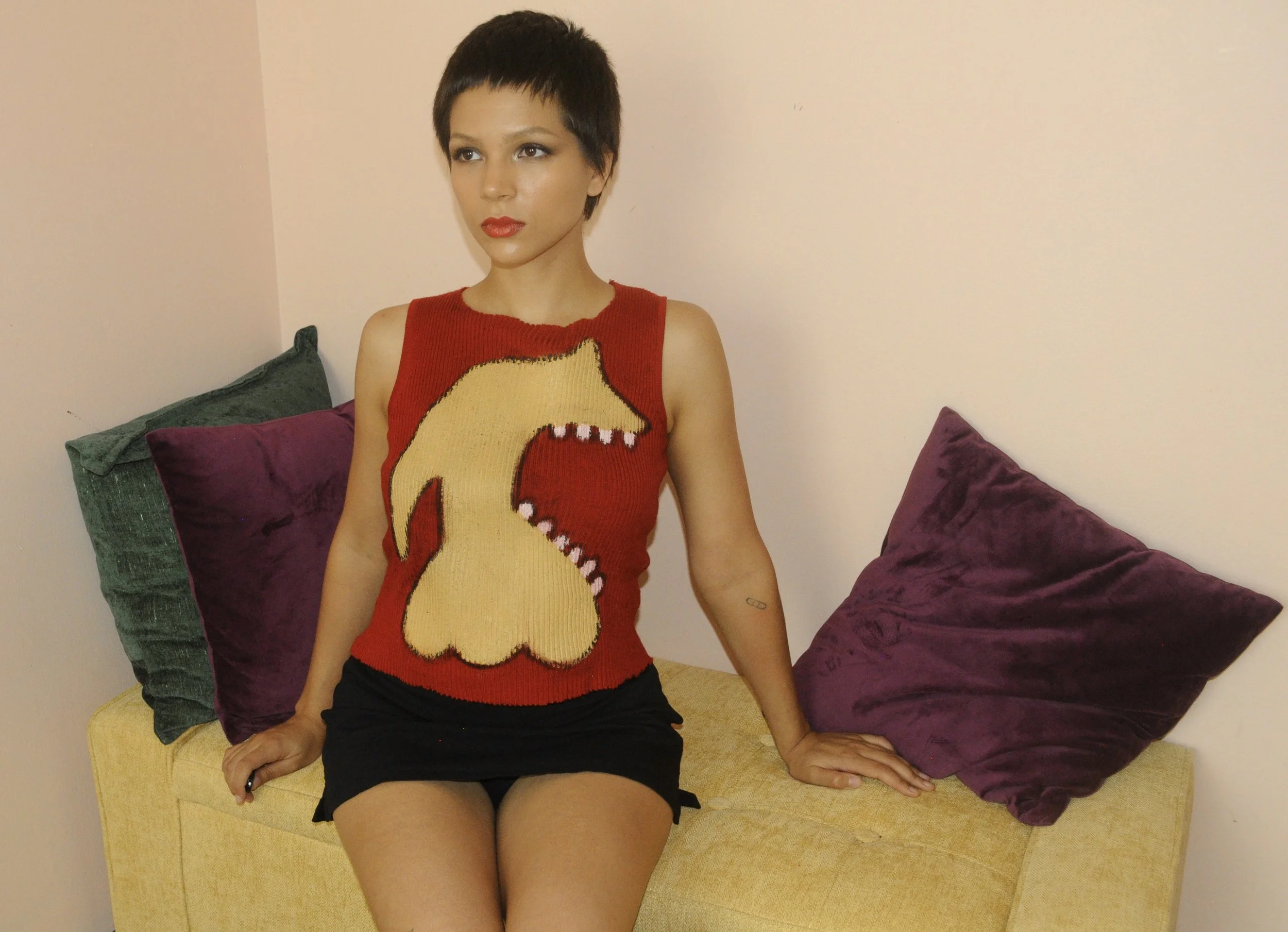
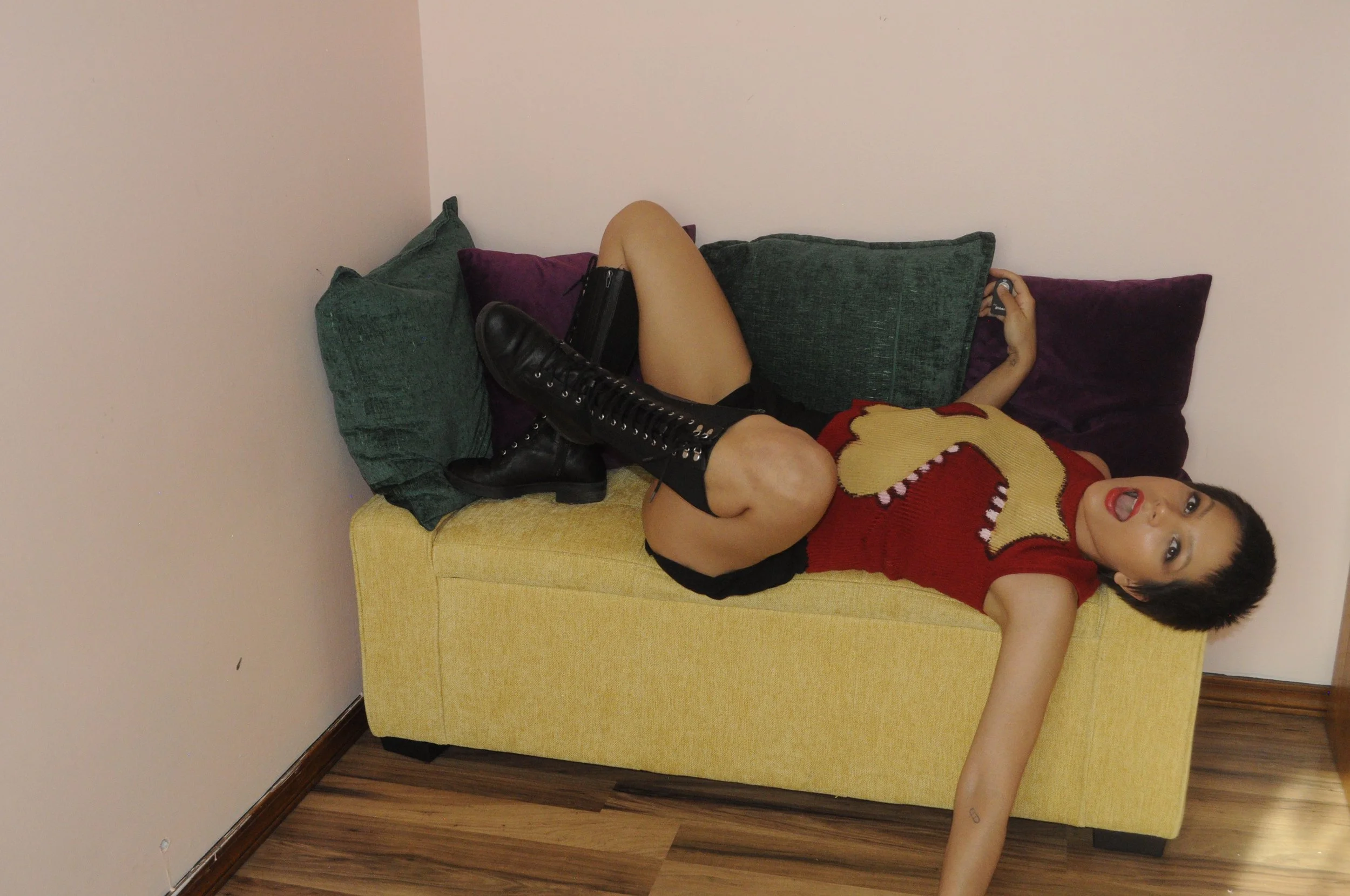
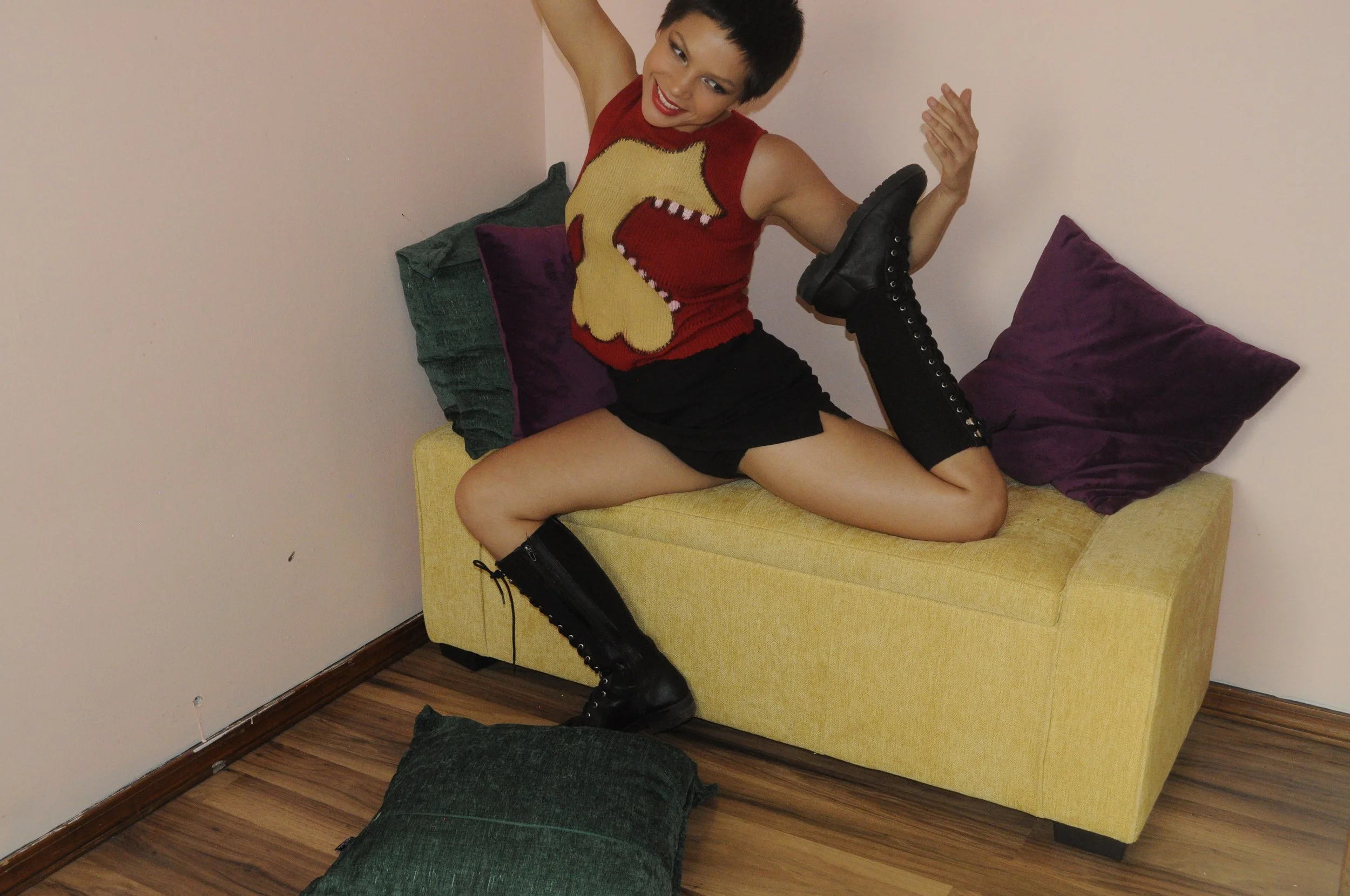
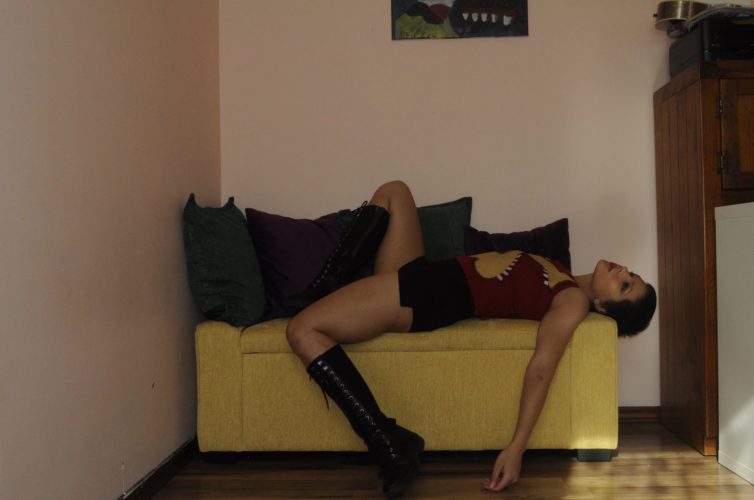
CHOMPER
After my makeshift screen printing attempt, I realized hand painting would be more practical and less of a headache… or so I thought. Painting on fabric can be quite annoying, depending on the type of fabric and the amount of water or fabric medium, but thinning the paint down creates a different visual effect. I was aiming for another clean design similar to screen printing, and so CHOMPER was born out of an impulsive reaction to my previous design, PUPPY. CHOMPER required multiple coats to achieve the heavy body screen printing effect, resulting in an almost shield-like texture on the garment, which is still very functional to wear. The red garment was originally a short-sleeved turtleneck, which I then cut by hand to be a sleeveless top with a raw neckline. The result of CHOMPER is a quirky and bold beast that certainly captured the graphic quality I intended.
MORAL OF THE STORY
I make a lot of things, a lot of things that just sit there, and while a part of me doubts their potential to do anything with them, there is another side of me that says no, I can’t just let them sit there and rot away. I saw these pieces as an opportunity to transform them into something bigger than they are, and also as a path to delve deeper into my artistic exploration as a designer, photographer, and performer. A photoshoot was on its way—but it took months to actually take the next step outside of them hanging in a closet.
The process of styling and shooting is unbelievably fun. Exploring potential photo shoot areas is an experience in itself, and then you arrive and question whether the environment's conditions are suitable for a photoshoot at all. I wouldn’t say time was wasted, but lessons were certainly learned.
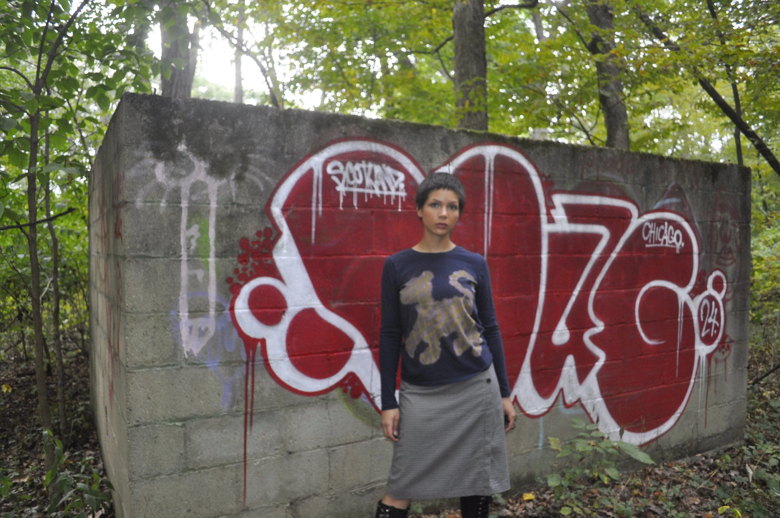
In heels and all of my equipment, I marched into the woods to find an abandoned, destroyed cement fortress, decorated in crude graffiti, but it was the color of the marks that made me think that would be an excellent spot. I did not prepare for the bugs, and my heels sank into the mud during the shoot. After reviewing the pictures, I realized this journey had just begun.
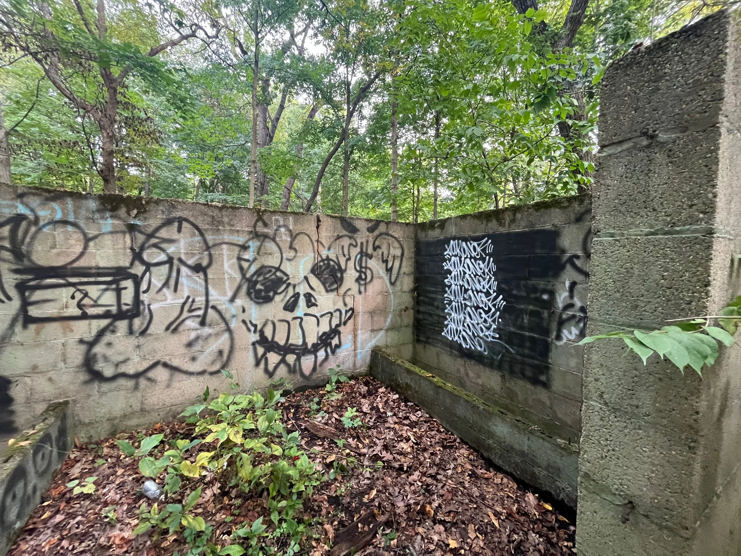
Penis Graffiti
What I thought looked cool.
Me struggling.
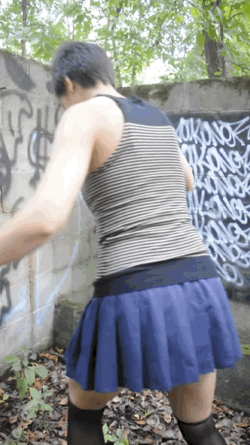
My next stop was a place I knew I should've gone to from the beginning: another local forest preserve. However, this one was more of a prairie, with a lot of sunshine, clouds, and a brick wall that I had envisioned. Unfortunately, I was not alone there, and I so badly wanted to shoot in private, but this was a learning experience that allowed me to embody my truth as an artist and do my own thing, while being perceived. I was certain that this shoot would be my last. Still, after reviewing the pictures, I realized that not only was I lacking elevated thought in styling decisions and modeling poses, but also in how to simply use a camera. Although this shoot really enhanced my confidence and helped me connect with a side of myself that I don’t see often enough, the delivery was just not up to par. Since I was already committed to this project, I wasn’t going to settle.


I got realistic and decided that I’d have the most control in my own space. The last shoot was in my room, after I rearranged everything, and once again, I remembered why I got rid of my bed to have more space for my projects and play. This shoot took another two days because I was getting serious about really learning how to use my DSLR, but the results are something I can now say I am “proud” of. Using what I had at home, I was able to create a modest set design that utilized home decor, including a bed seat and colorful pillows. Shooting at home allowed me to play music loud and enjoy the company of myself in my own world. I felt confident and free to experiment as the model and photographer.
The Primal Collection did precisely what I had hoped the designs would convey: to bring out bold, unapologetic, and creative energy—and a reminder to push what might seem underdeveloped into new territories for growth.